The product selector, reworked.
A redesign of the Capital One credit card homepage that took a 95%-ignored dropdown and turned it into the primary engagement surface — +4.7% new accounts booked and +$14.7M annualized revenue.
I The problem
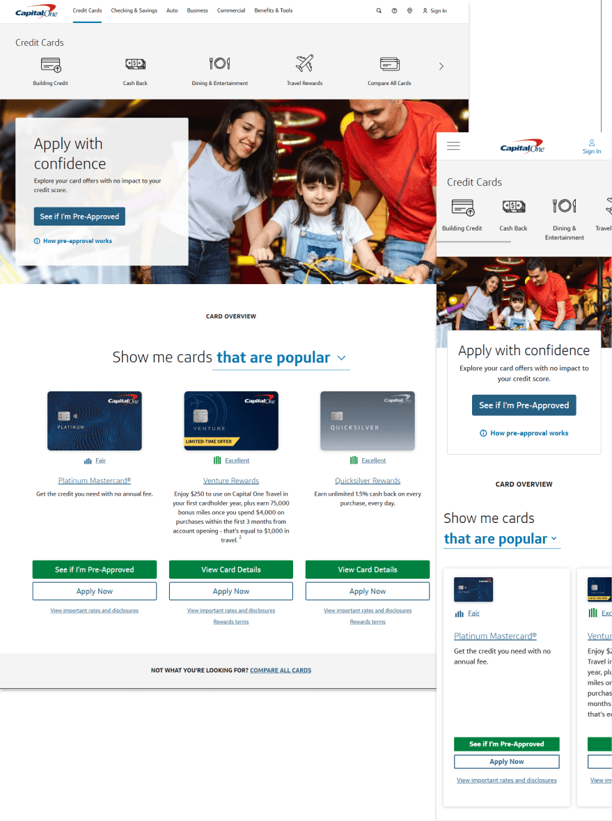
The card-category dropdown component on the homepage had ~95% non-engagement. Users lacked enough product knowledge to move forward with an application, and competitors were serving better browsing experiences with fewer required interactions — surfacing categories directly instead of hiding them behind a two-tap dropdown.
The opportunity: if we could lift new account bookings by 5%, the revenue math worked out to roughly $14M annualized.
II Approach
Audits before variants
Two audits framed the work — a visual design audit flagging alignment issues in CTAs, and a communication design audit focused on visual signifiers: what users thought was clickable, and what actually was.
Competitive analysis
Competitors collapsed the same job-to-be-done into a single tap (a button or link) where Capital One required two (open the dropdown, then select). That gap defined the solution space.
Ten+ variants, eight tested live
I produced 10+ rapid variant designs — including a ghost-button prototype for market testing. Eight of them ran as live experiments on the Capital One site.
III The winning variant
Three changes carried the lift:
- Swapped the set of card products surfaced by default
- Underlined product text-links to signify the ability to learn more
- Added a "View Card Details" CTA for products the user wasn't eligible for
The dropdown itself was retained — the fix was framing and signifiers, not component-level replacement.
IV Outcome
+4.7% new accounts booked. +$14.7M annualized revenue. The design has remained live as of 2025 — you can verify it on capitalone.com/credit-cards.