The official COVID-19 dashboard for Michigan, commissioned by the State of Michigan and built by the UM School of Information (UMSI) and School of Public Health (UMSPH).
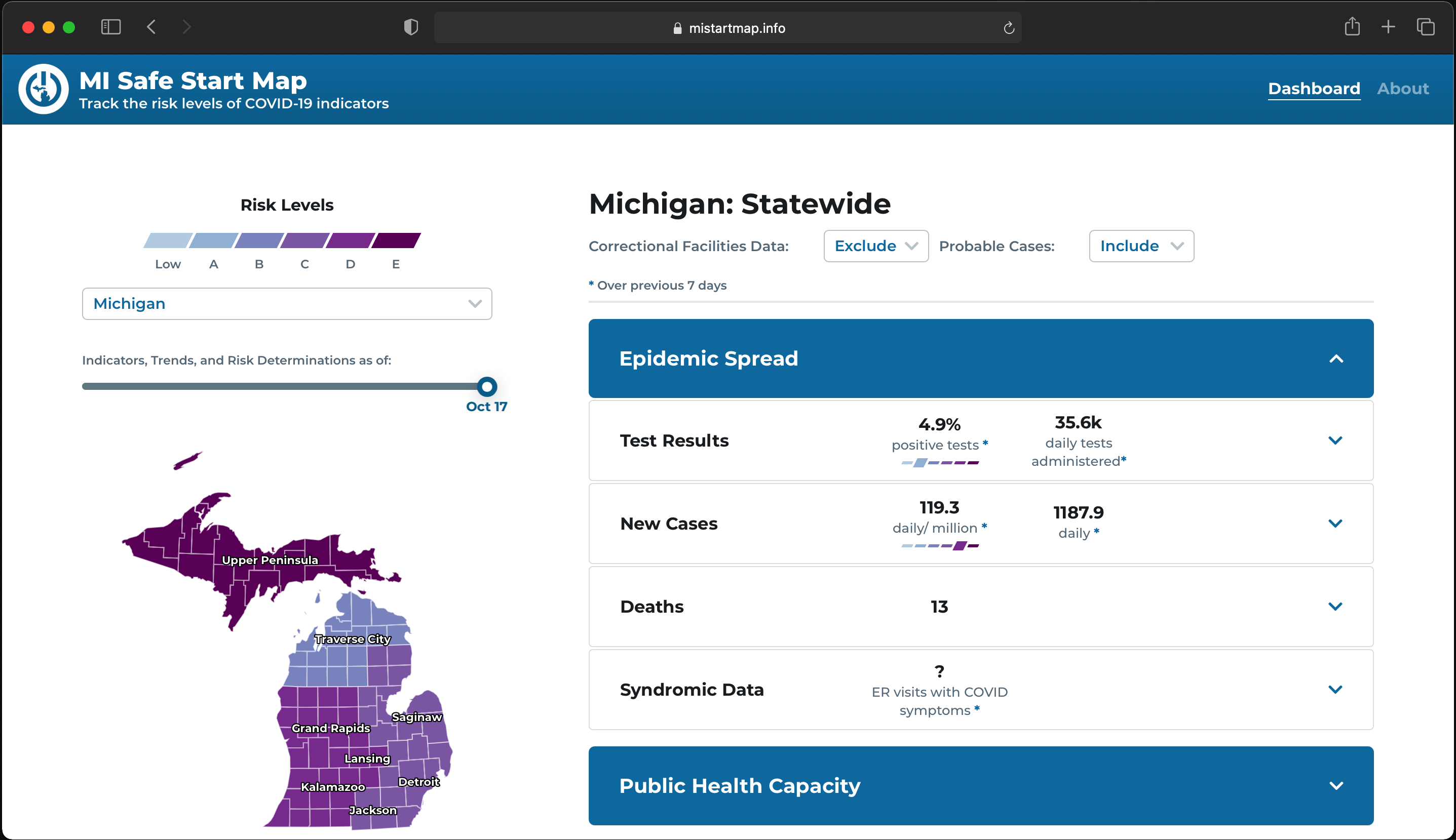
Live dashboard screenshot as of October 21, 2020
Timeline:
Ongoing, April 2020 - Present
Roles:
Co-designer, Co-researcher
Tools:
Figma, Qualtrics, Slack, Trello, Zeplin, Zoom
UX Team:
James Benjey, Nupur Bindal, Alex Fidel, Gabriella Gazdecki, Ashley Hampton, Rhea Kulkarni, Mustafa Naseem, Cleo Pontone, Michael Rigney, Dominique Roitman, Tess Mendes, Sophia Timko, William Zhang
Description:
Due to the rapid initial outbreak of COVID-19 in Michigan, a high-level state
task force comissioned this dashboard in late April. From May to August, I researched and designed with
various teammates listed above.
Beginning in September, I began pursuing an
independent study
under Professor Mustafa Naseem to spearhead user research. From October to December, I concluded the
project by co-designing
interfaces with Alumna Cassandra
Eddy.
The State of Michigan needs a data-backed resource to decide whether to initiate statewide re-opening procedures or reinstate shut-down procedures amidst the COVID-19 pandemic.
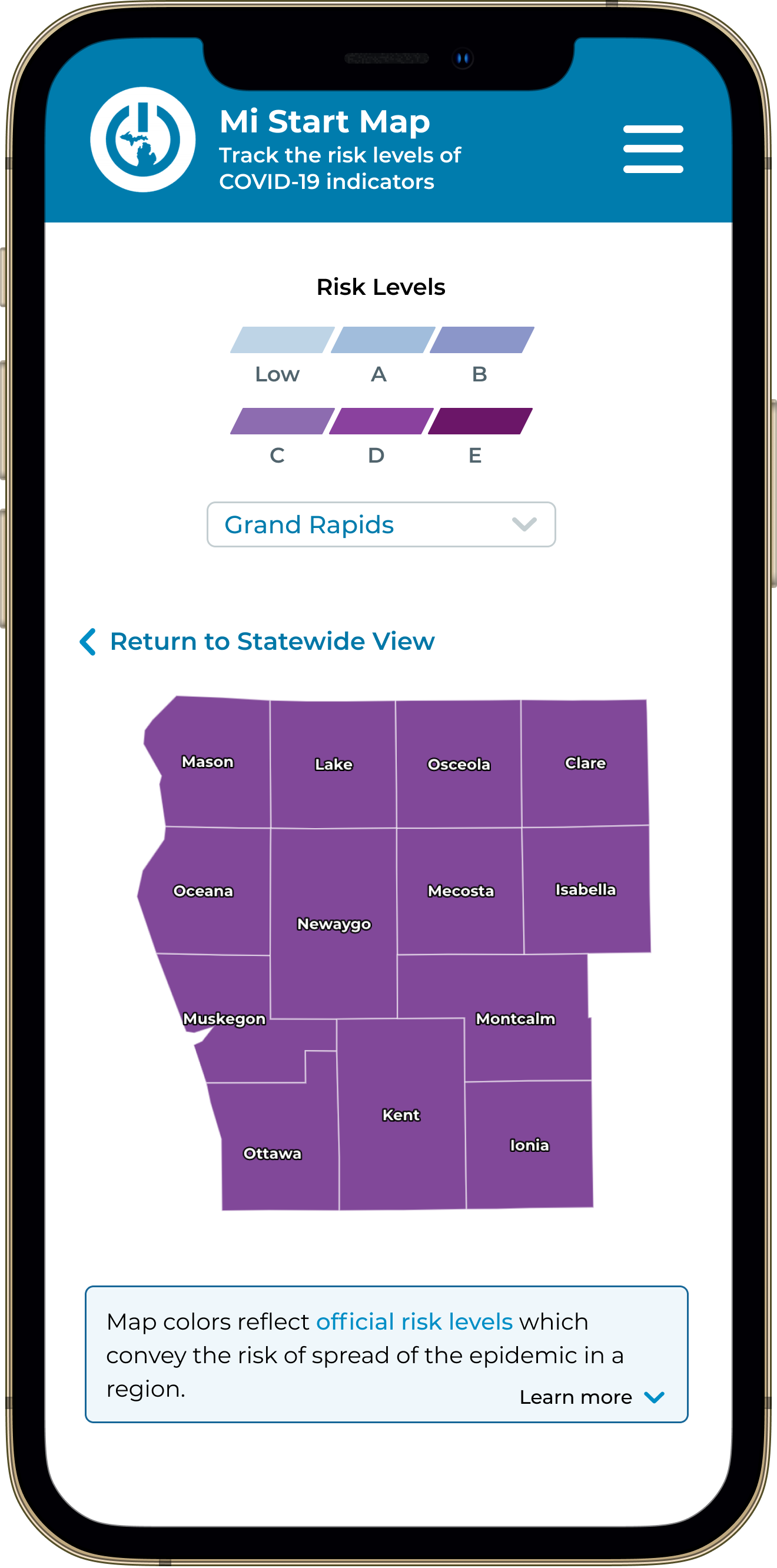
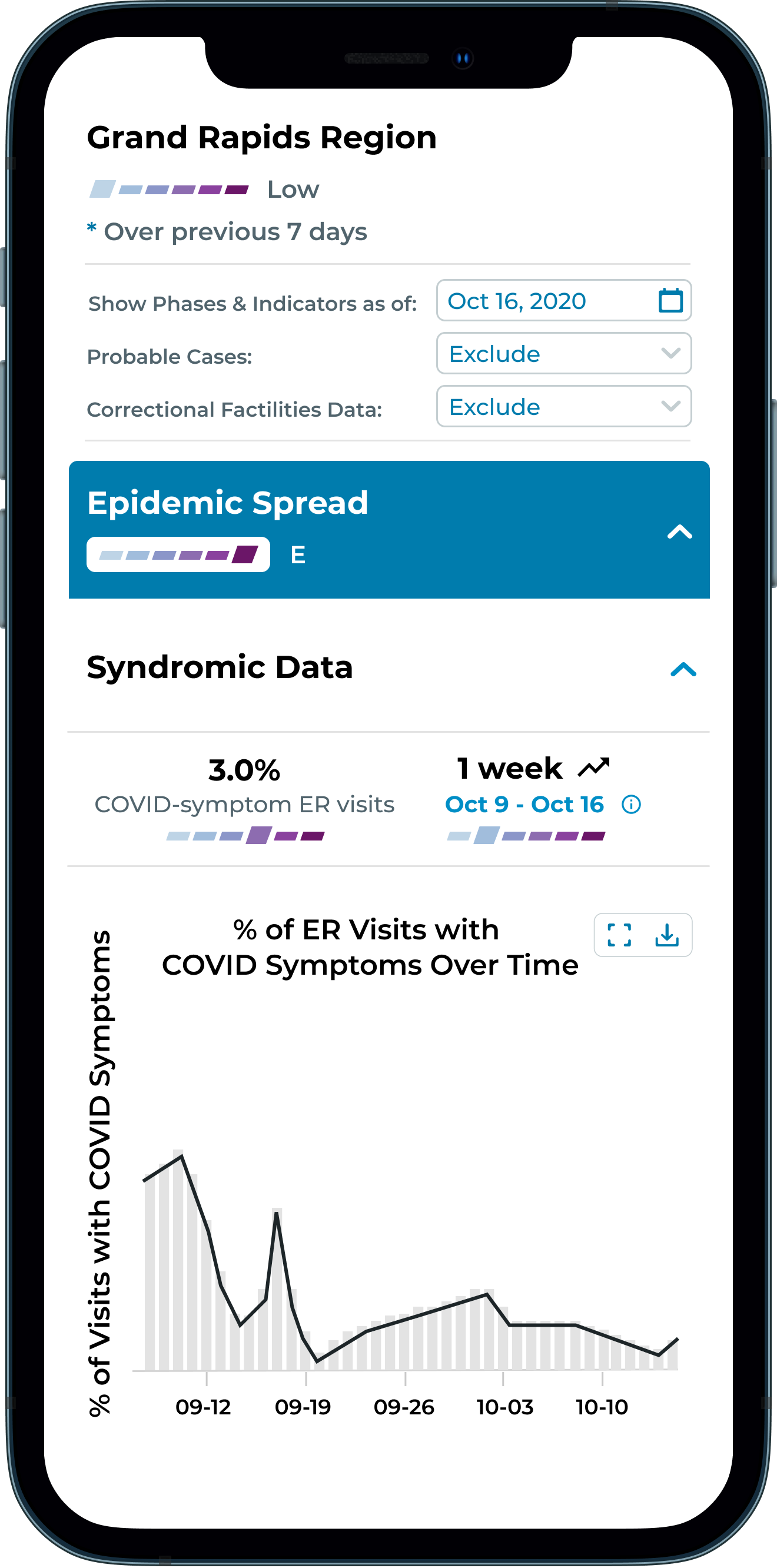
The dashboard tracks COVID-19's public
health indicators for Michigan. The two primary indicators displayed on the dashboard are
Epidemic Spread and Public Health Capacity.
There are 2 versions of the dashboard serving 2 audiences:
Because the State needed the dashboard as soon as possible due to the quickly flaring pandemic, there was no time to deeply explore the problem space. We gathered requirements with the Michigan Department of Health and Human Services (MDHHS). Our team prioritized the private dashboard and quickly designed initial versions of the private dashboard shown below.


Once developers launched a closed-beta
private release, we performed user-tests and interviews to gather needs of the
public
health workers and government employees.
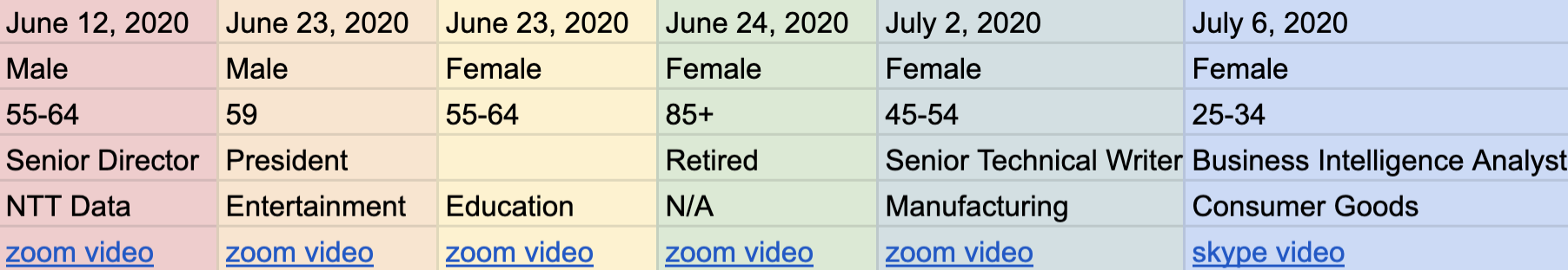
We started off with a pre-test questionaire to get the user's device and professional background.
Then, we walked the user through typical tasks that a public health worker would
complete on the dashboard.
Lastly, we concluded by asking for feedback on our tasks, usability
aspects to
prioritize,
and any other concerns regarding the dashboard's public health features.
⦿ Specific data at the regional and county levels are lacking
⦿ Data must be easily and quickly digestible for those that don't interact with COVID-19 related info
⦿ Downloadable raw-data from the dashboard is desired so that officials can conduct independent analysis
Roughly 2 months after the launch of the public dashboard, we needed to ensure that general public users could also easily use the dashboard to gather and understand the data they needed.
We opened with an empathetic semi-structured interview to cultivate user empathy and establish rapport with the public. Then, walked users through simple and typical tasks that public users would complete on the dashboard. We concluded by asking for feedback on our tasks, perceived usability on different features, and open-ended questions asking about general public use-cases.
When September came,
I was one of two designers left on the team. Lack of resources and time prevented typical user research
initiatives. So instead, I conducted an expert-user cognitive walkthrough, putting myself in the shoes of
a general public user and completing a typical task.
The goal of my walkthrough was to
discover functional
issues not addressed in previous iterations which prioritized platform features over dashboard usability.
Find out the current state of COVID-19 for the city of Ann Arbor, which is located in Washtenaw County.
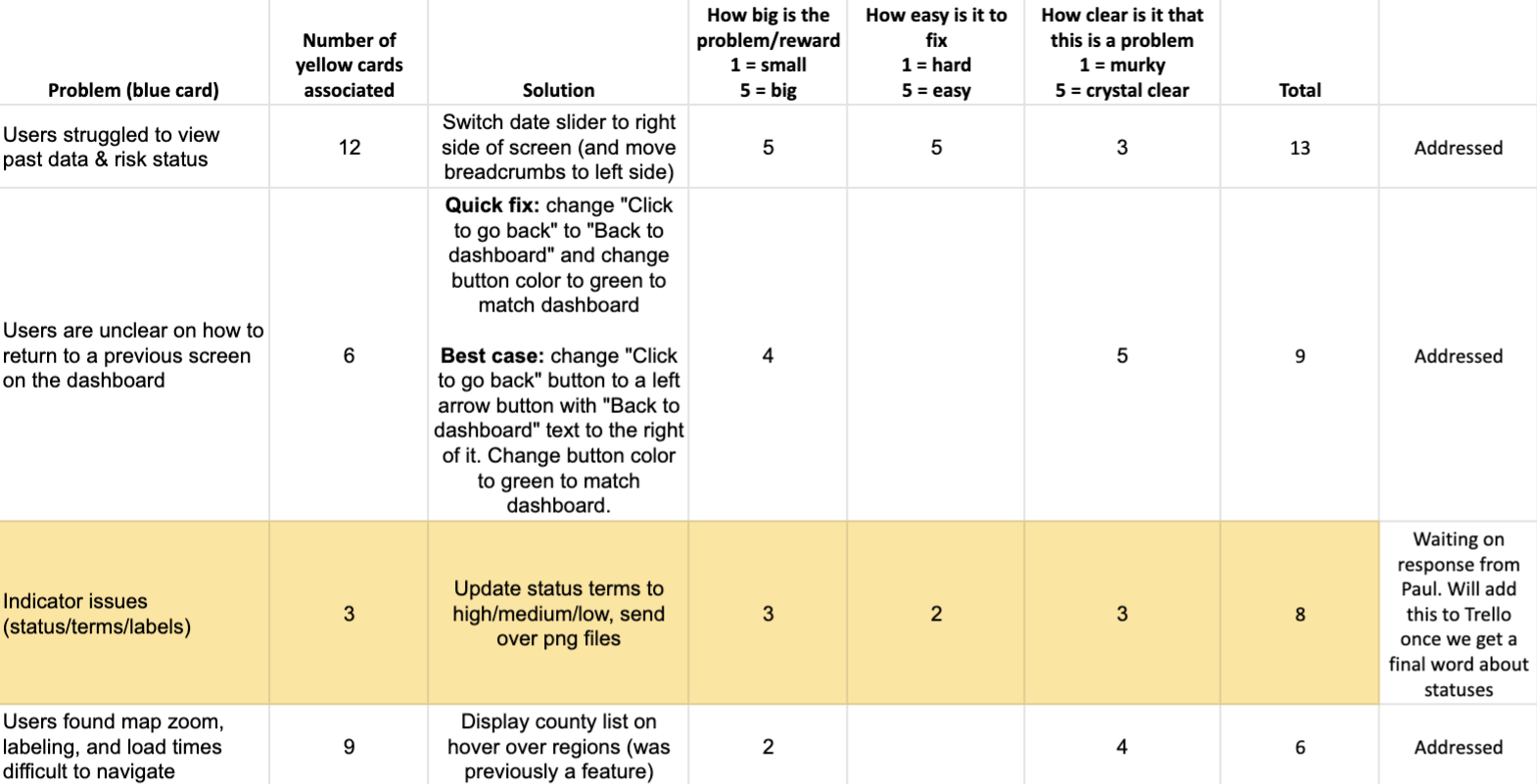
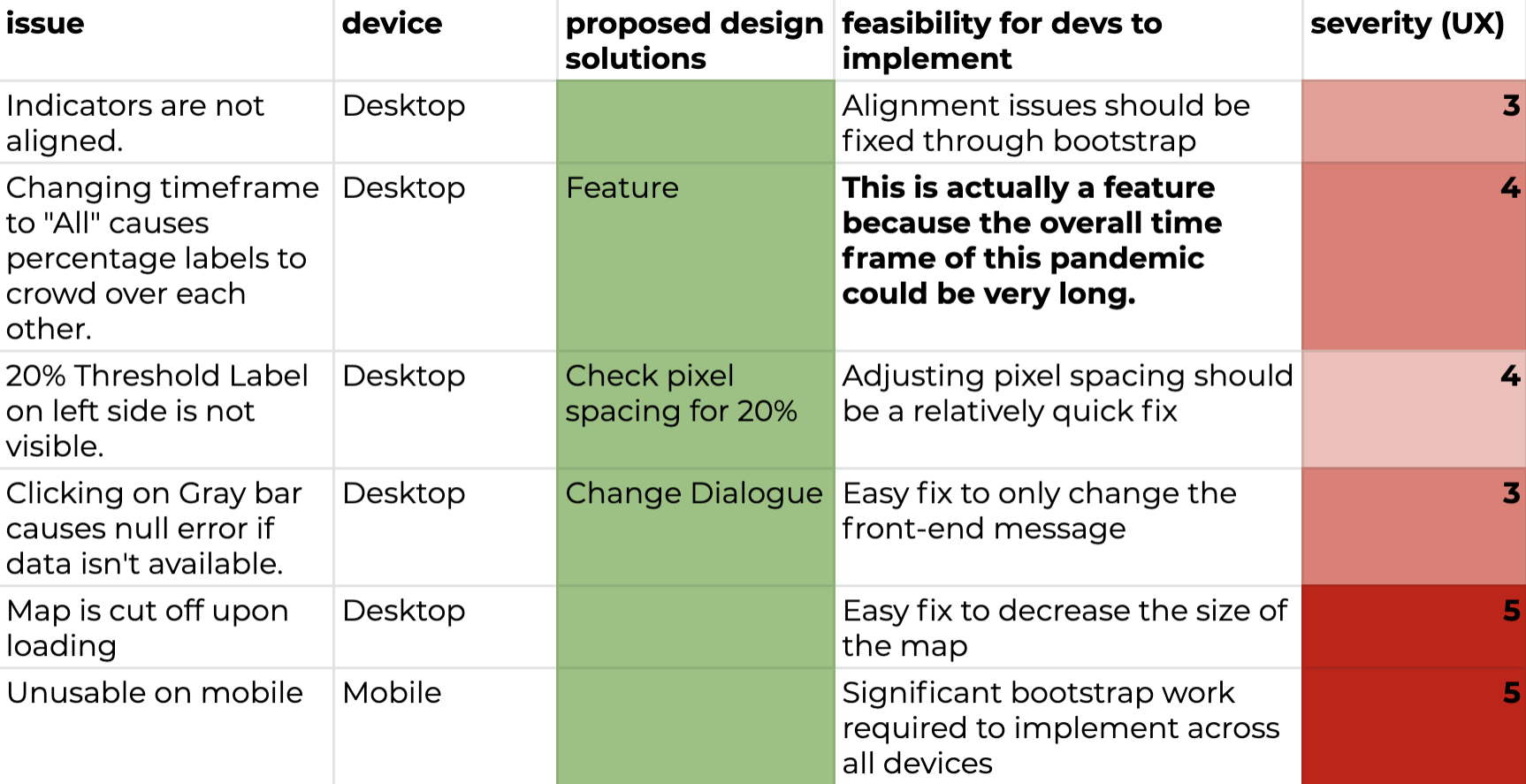
After watching myself complete the task while thinking out loud, I summarized and ranked the problems I experienced and brainstormed solutions to handoff to our developer.
One of the most challenging and aspects of the dashboard's
design
was the color scheme. This was constantly a point of discussion because we wanted to ensure the
dashboard adhered to accessibility standards. However, due to state demands, we had to adopt a color scheme
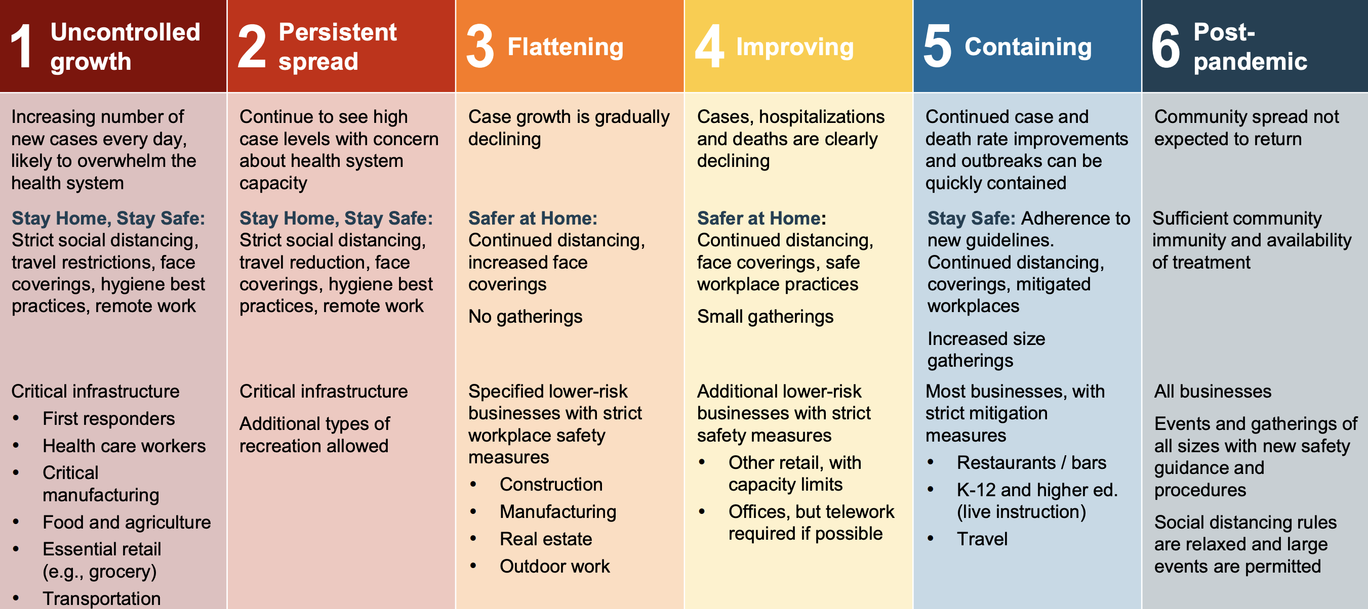
that strictly abided by Governor Whitmer's reopening plan phase colors. This was our first iteration and it
was on the live dashboard for many months.
Mapping the indicator color on the dashboard's map with a reopening plan phase can be critically misleading. For example, a region that has not experienced much infection early-on in the pandemic would have the color that is considered "post-pandemic" as shown in the phases below.
To address the confusion caused by the reopening phase color scheme, we decided to move towards a monochromatic color scheme that had no ties or resemblance to the reopening plan phases.

Now, we needed to design a color scheme that
accurately portrayed and communicated the logical, emotional, and behavioral impact of a certain risk level.
Our primary stakeholder from the state health department mentioned that among the public health community, the
second iteration
communicated
too much danger and fear because of its red
tones. The second iteration was never released onto the live dashboard.
Eventually, I settled down on a cooler color scheme that used our new risk level indicator legend, replacing
Medium, Medium-High, High, Higher, and Highest with A, B, C, D, E, and F respectively. The third iteration is
currently live on the dashboard, and has
cleared confusion related to the reopening phases color scheme.
The private dashboard called for unique icons that matched CDC case trends. This was challenging since CDC trends involved highly specialized language and complex meanings had to be broken down into simple and easily identifiable icons.

In addition, public
health stakeholders also needed specific
icons for low-falling trends (scenarios in which COVID-19 is under-control or becoming under-control):

This brought us to a grand total of 9 case-trends/distinct icons.We concluded with a post-test questionaire asking for feedback on our tasks, usability aspects to prioritize, and open-ended questions asking about general public use-cases Since there were only 6 risk-levels to map with the 9 case-trends, I worked hard to manage expectations with public health stakeholders. Not only were we able to consolidate certain CDC case-trends, but also group every low-falling trend under the "Low" risk-level.
Excited to contribute towards such an important dashboard, I
quickly became lost in the public health terminology, software requirements, and fast-paced
interactions. I realized working on
the team
required continuous, iterative, but patient efforts to make meaningful contributions.
Taking initiative, asking the correct questions, and being open to learning from more experienced faculty and
graduate students allowed me to grow as
they mentored me and shared proper design and research practices.
At the end of the day as designers, I helped design the
dashboard
to satisfy public health needs. Often times, public health experts expressed opinions that
differed from our initial design decisions.
Rather than viewing these differences as roadblocks in our
design process, I viewed the feedback as expert advice and a unique perspective when designing.
Having regular conversations through daily stand-ups, weekly meetings, and slack messages allowed me to
keep learning, empathesizing, and understanding our stakeholders.
Advocating for dashboard users by defending designs was the
most crucial takeaway from this project. Throughout this entire design process, our design team regularly
interacted with users and sought out concrete
data to justify design decisions.
Constantly giving users a voice at the table and synthesizing their feedback
into robust and accessible designs is not only a philosophy that our team followed, but a
mindset that I have forever adopted as a designer.
Below are published articles regarding the dashboard
and our team's work. Click here to
view the live
dashboard.